Hey Batter: How Many Swings Per Run?
For those of us in Red Sox Nation, the second half of summer has typically brought the beginning of the end. This is the point in the baseball season that our beloved Boston Red Sox tend to slowly - and steadily - drift from the top of the standings toward the middle as we approach the critical days entering autumn. More than a decade ago, my oldest son said to me over breakfast: "Dad, this is the year." That is when I knew he joined the ranks of the hopeless Red Sox loyalists. PLAY BALL!
Baseball Is A Game Of Statistics
The major league baseball season usually includes 162 regular season games over 26+ weeks and up to 43 postseason matchups to determine the World Series winner. That is a LOT of baseball. As a parent of three wonderful boys, I could barely make it through a spring as a bleacher creacher during Little League season. Thank goodness they (mostly) made the jump to lacrosse where the games are measured in minutes instead of innings! One of the reasons that baseball plays so many games is - of course - economics. People will actually pay to watch 162 games of their favorite team each season. The second is based on statistics. The margins of winning are so slim that it takes a VERY large number of games to separate luck from skill and determine a champion.
Investing Is A Study Of Probability
No only is the question how many games does a team have to play, but how many at bat chances does a player receive during a full season. Like baseball, statistics are an investors friend when researching investment strategies. Terms like mean, standard deviation, and the big P - probability - help us to set reasonable expectations for the likelihood of reaching our financial goals. They are also the key tools we select the winners and the loser that populate our portfolios over our own investing season. I jokingly say that my only goal as an advisor is to be less completely wrong than most other advisors over a long period of time. The reason is similar to the on base percentage (OBP) in baseball. 100% success is a folly and 0% success OBP gets you a cold seat on the bench. 20%, 30%, 40% are all respectable numbers for OBP to help out your team throughout a long season.
Investing is very similar. We will get some free bases. There will be some sacrifice bunts. Base hits will be common. Doubles and triples less so. Sprinkle in an occasional home run with runners on base for the icing on the proverbial cake. Two investing metrics have an especially long history in the record books. These are the monthly returns on the Standard & Poor's 500 (S&P 500) and the interest yield on the 10-year Treasury bond. Two more pieces of information well documented about the S&P 500 are the dividend and earnings amounts for this very popular stock index. These can be formulated into valuation metrics by dividing their point in time values by the S&P 500 price level on that same date. The resulting dividend yield (DY) and earnings yield (EY) for the S&P 500 are plotted in the chart below for the 150+ years between 1871 and 2021 (March).

We can see that over the course of 150+ years the earnings yield (EY) is usually larger than the dividend yield (DY). This makes perfect sense because dividends are paid out of earnings and a dividend payout ratio (DY/EY) greater than 100% is unsustainable for more than a short period of time. We further notice that the maximum, median, and minimum values for the EY were 18.82%, 6.73%, and 0.81% respectively. This is a much larger range than that for DY over the same period of time (13.84%, 4.26%, and 1.11% comparatively). As a side note, the 10-year Treasury bond posted maximum, median, and minimum yields of 15.32%, 3.82%, and 0.62% since 1871. More on this idea next week! A final observation is that the current of EY (as of March 2021) was 3.28% - well below the 150+ year median of 6.73%. This may indicate that future returns for the S&P 500 may be much lower than historical median returns.
Mean Reversion Happens!
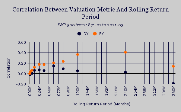
Speaking of future returns, the grand slam of this little exercise is to determine whether using either of these two valuation metrics would have been helpful in predicting price performance of the S&P 500 over a long period of time. The chart below shows the correlation for both DY and EY against future price returns measured in months (M) from 1871 forward to 2021 (March). The first thing we notice is that the EY correlations seem to be higher for all return periods ranging from 1M to 360M. A second observation is that the EY is positively correlated with all sampled rolling return periods. This was not the case for DY, which demonstrated negative correlations in the very short term and very long term return periods. A third thing that pops out is that there is a diminishing slope to the correlations between EY and rolling return period that actually declines after the 20-year mark. Finally - and what grabs my eye the most - is what happens at the very short end of the rolling return spectrum. The increases in correlation are most abrupt when we move from 1M to 2M and 2M to 3M forward return periods. This may be akin to the aforementioned OBP used in baseball and it shows that earnings yield (EY) could be used as a rough proxy for calculating expected returns for broad indices (like the S&P 500) or for individual stocks in our prospective portfolios.
Resources
http://www.econ.yale.edu/~shiller/data.htm


Comments
Post a Comment