Rescaling The Obvious
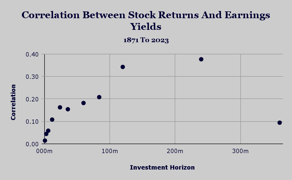
Source : Shiller Data, JQR Capital Earnings Yield Returns Last week we glanced at the predictive power - as measured by the correlation coefficient - between earnings yield and stock returns. We see from the chart shown below that the predictive power appears to increase almost monotonically as we look further forward in our investment horizon. This again highlights the idea that over the long run, fundamentals (corporate earnings are about as fundamental as things get) matter the most to investment returns. Source : Shiller Data, JQR Capital Rescaling The Obvious The type of chart we display has an affect on our perception of this data. The previous chart is the bar style with an unscaled horizontal axis. This makes it seem like we want to hold our portfolio positions for 240 months - or 20 years - before hitting the rebalance button. Transaction costs (as measured by trading commissions) have recently dropped to near zero due to digitization and competition. We now change...
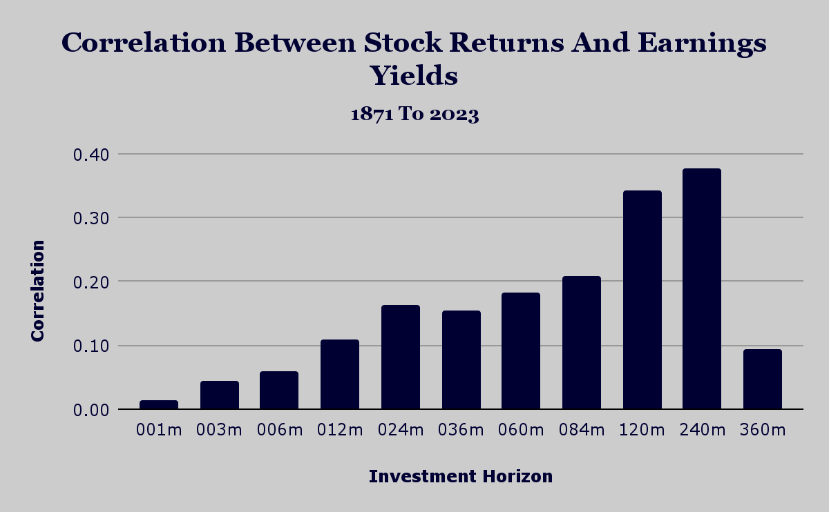
.png)